Magnet Is An Essential macOS App
Originally Posted: February 15th, 2020
It's so good it should be part of the system
There aren’t many thing about Windows 10 that I wish Apple would copy, but window management is one of them.
In Windows 10, you can grab the title bar of any window and drag it to the edge of the display to snap it, filling half the screen. On the other half of the screen, your other open apps go into an expose-like view, allowing you to pick a 2nd window to make a 50/50 split view quickly and easily. It doesn't hide the Start Menu, it doesn't become a pair of apps — it simply resizes the windows, and they still behave normally.
Windows snapping UI in action
As someone who moves between macOS for personal use and Windows for work, I always miss this feature when I go back to my Mac. When you expect windows to snap into place and they don't, it feels unintuitive.
There are other ways to manage windows built into macOS, but I find them all frustrating to work with in comparison. Apple added full screen mode in macOS 10.7, split screen in 10.11, and a contextual shortcut menu in the full screen button in their latest release, macOS 10.15 Catalina. If that sentence sounded confusing, it's because the features themselves are confusing.
With the latest change to window management in macOS, you can long press on the green full screen button in the top left of a window, and choose which side to pin against. This brings you to the expose-like view that Windows uses, but also comes with the frustrations of using full screen mode in macOS, including hiding your menu bar and the individual windows not behaving normally.
The gallery below shows how macOS handles creating a split screen normally. Notice that the Menu Bar disappears, and the apps become a pair in their own space. Getting into and out of the mode is clunky, unintuitive, and it breaks a few fundamental windowing concepts.
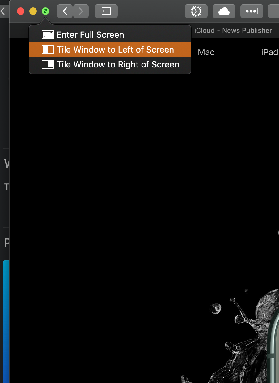
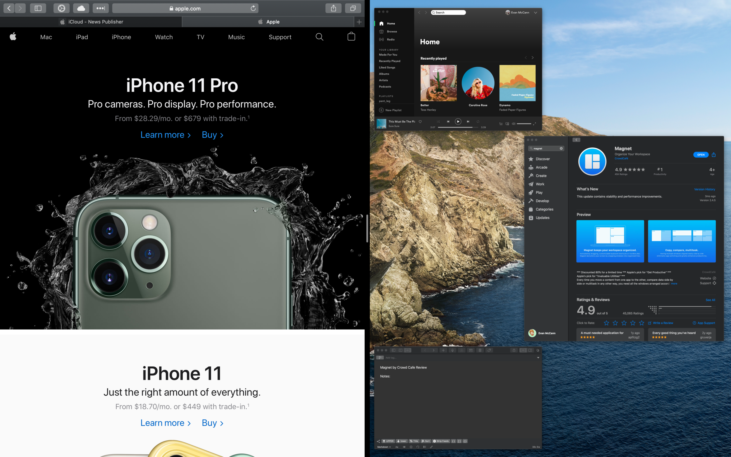
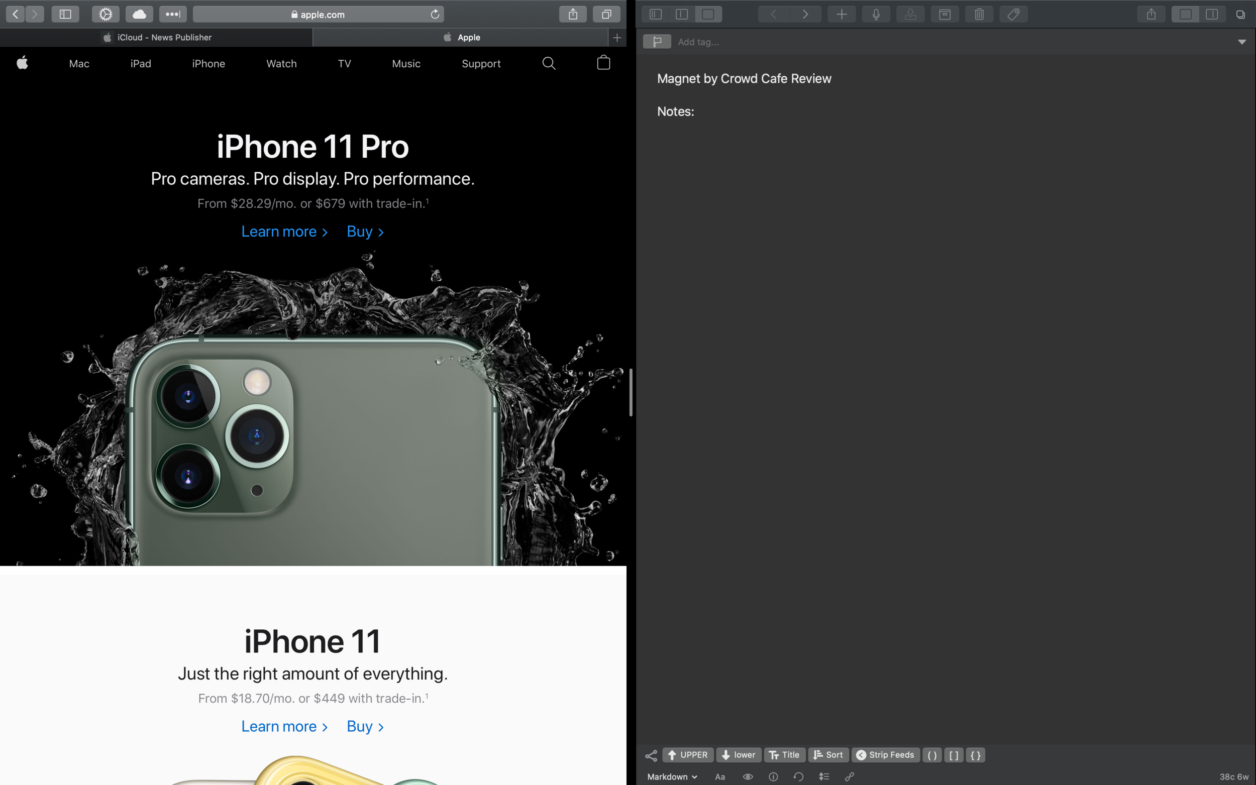
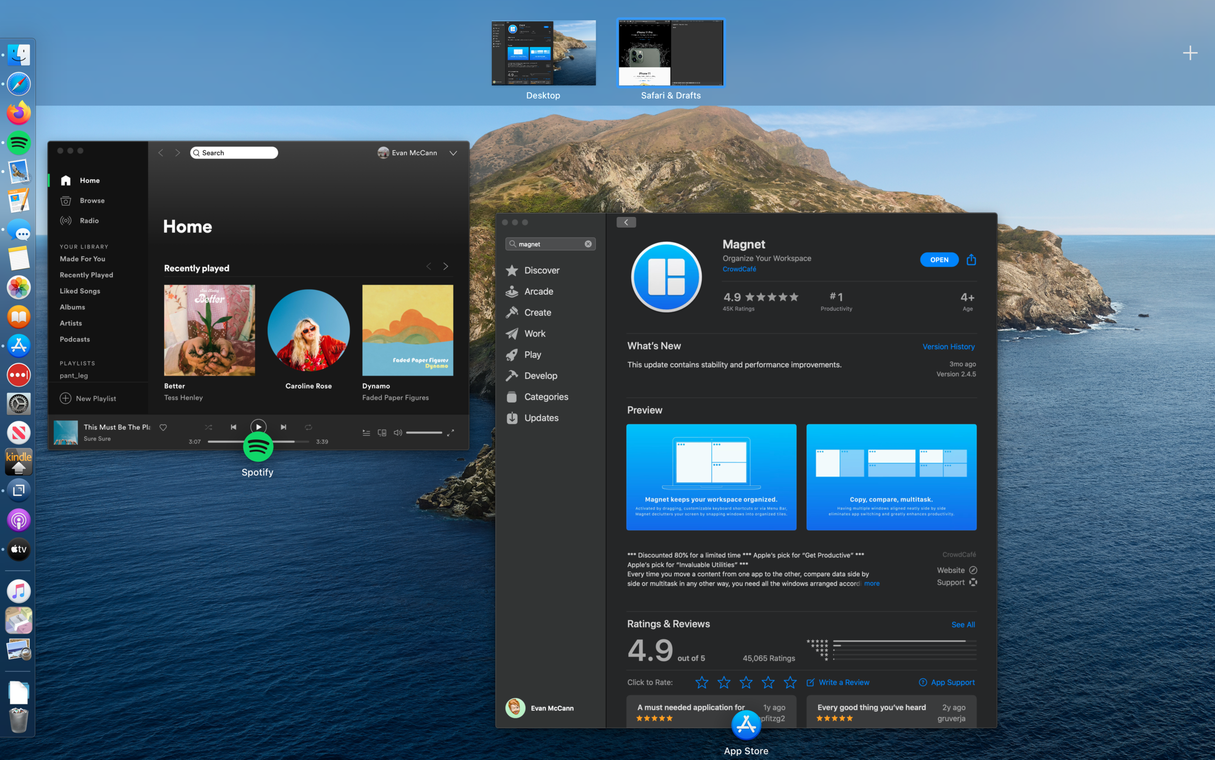
Long story short, macOS does have some built in features for pinning applications, but they are not as quick or easy as just dragging the window to the side. Magnet fixes that.
Magnet, from indie app developer Crowd Cafe, brings some of that window management behavior to macOS. It also offers other automated options to organize your screen and customize your Mac. It's one of the rare apps that is so good, I can't imagine using a Mac without it.
When you drag a window near any edge of your display, you’ll see Magnet kick in and preview the area of the display where it’ll snap your currently selected window. Let go of your mouse and Magnet maximizes the window to fill the tile. You can also drag the title bar up to the top of your Mac’s display to fill the display without going into macOS’s less than ideal full-screen view. The gallery below shows Magnet in action.
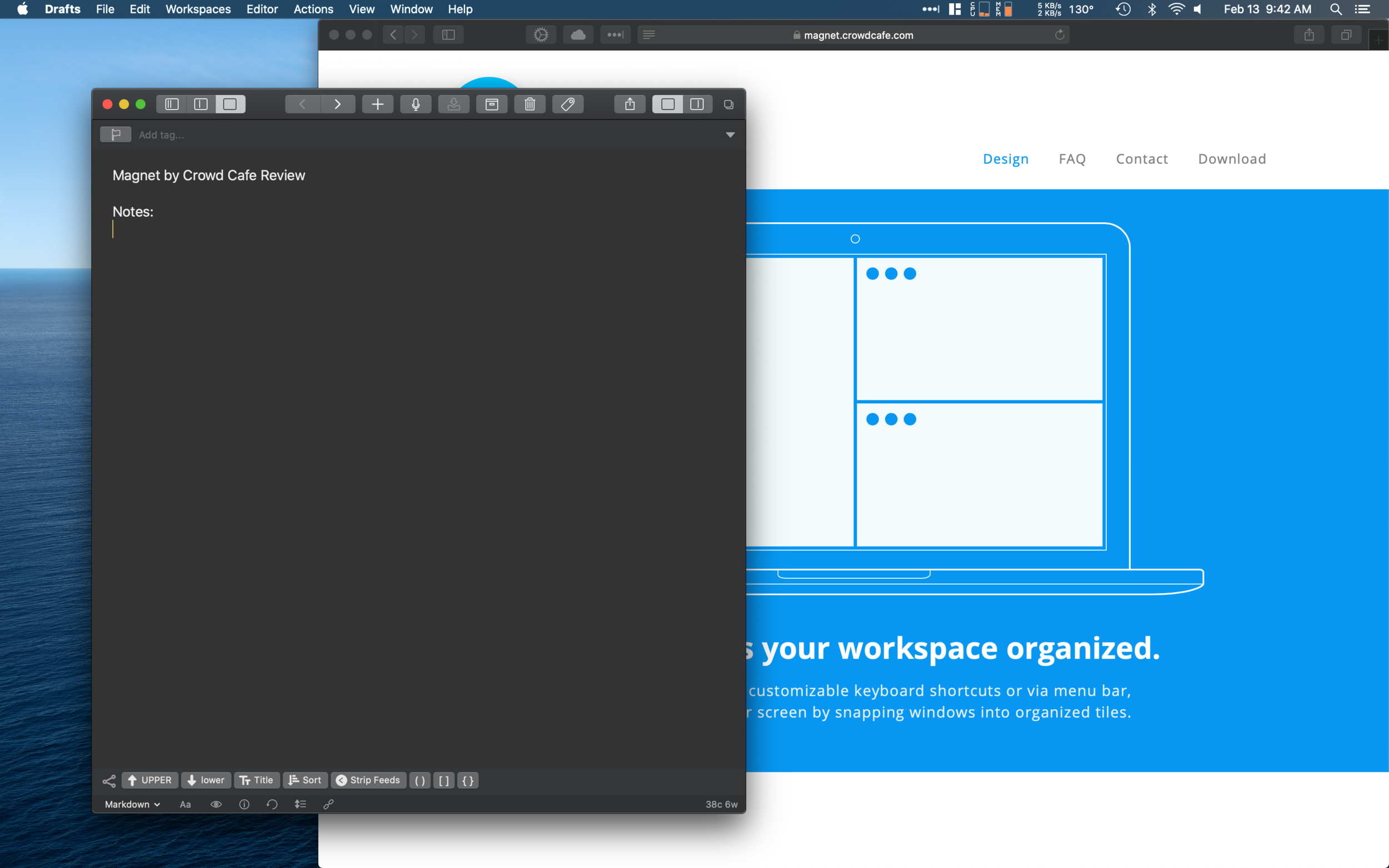
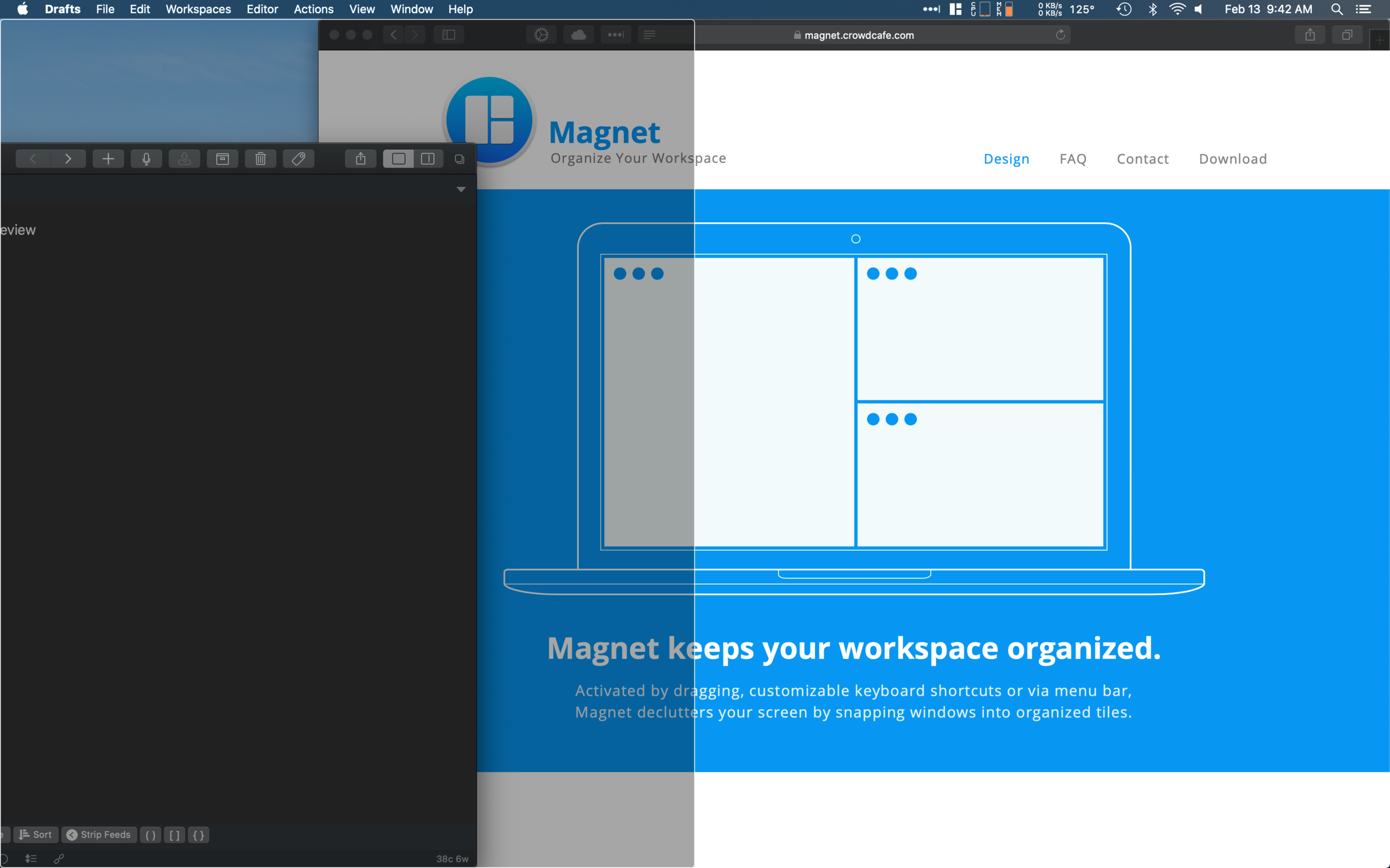
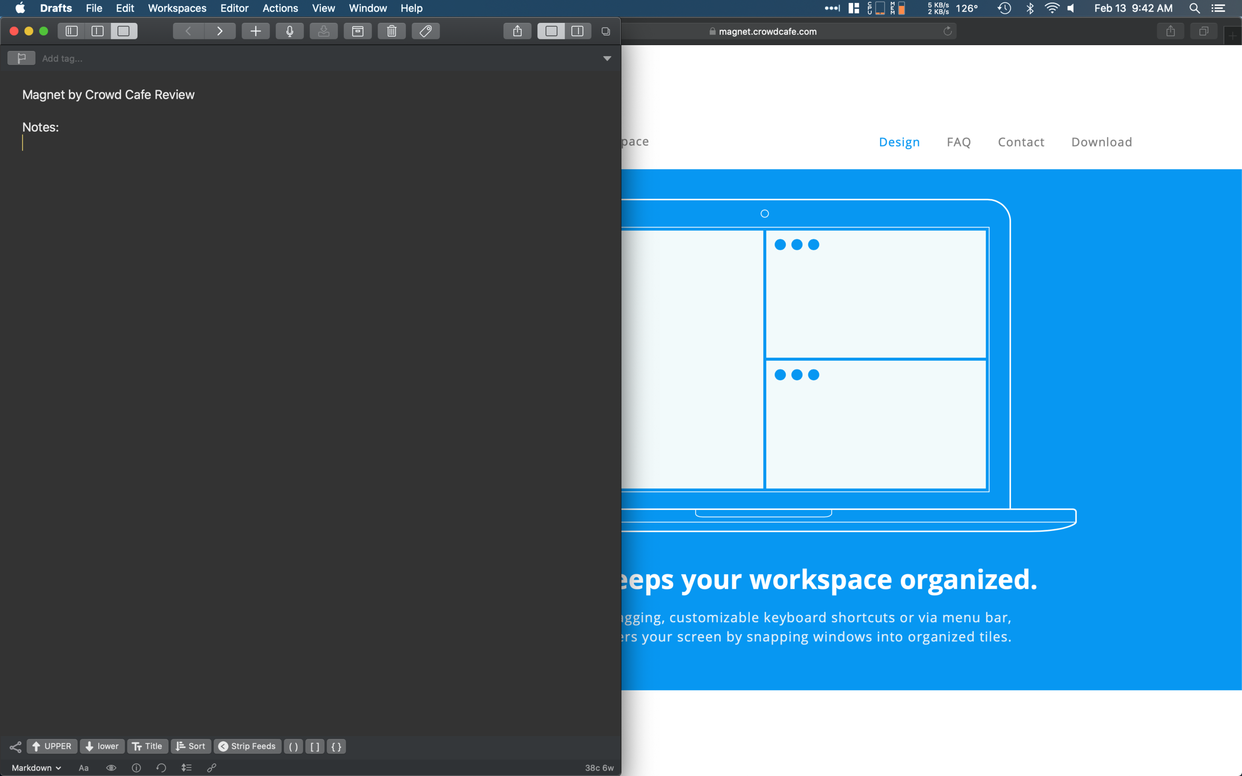
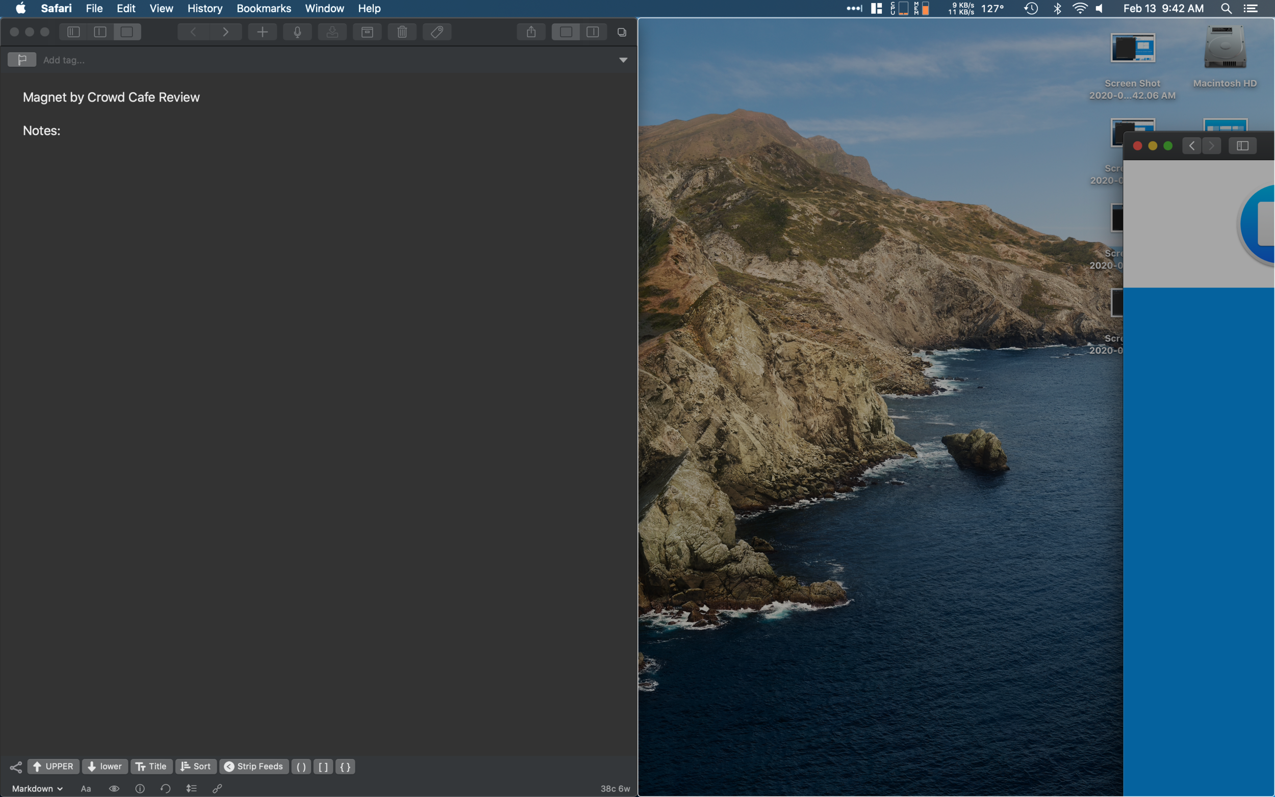
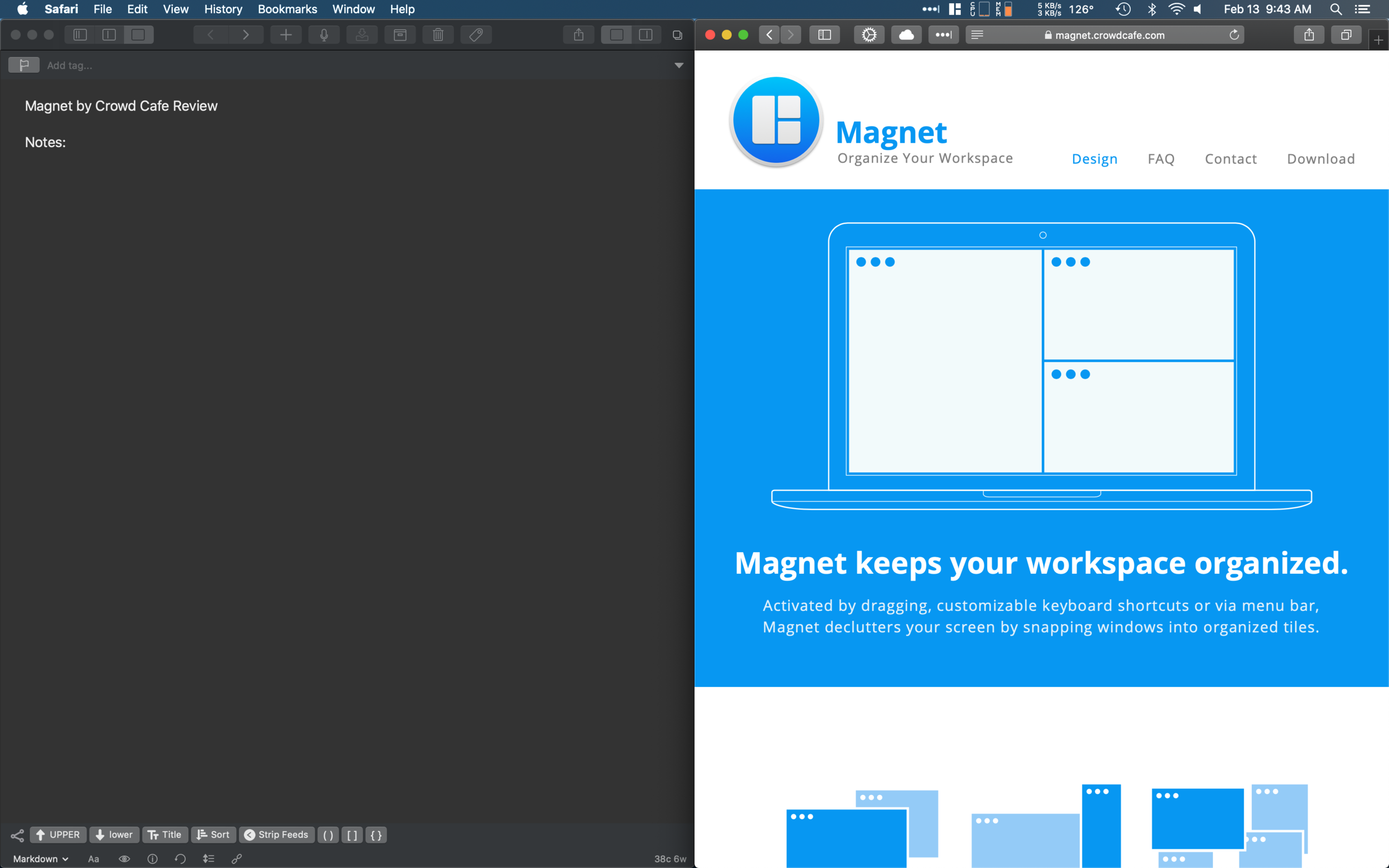
Drag to the right or left edge to snap your window into a 50/50 tile. It also works with vertical splits, 3 way splits, or having 4 apps, each in a corner. Just about any combination you want is possible with Magnet, without any of the delays or confusion of Apple's solution.
Magnet supports up to six external displays, allowing you to snap windows into tiles across a vast array of screen real estate, and Magnet also adapts to vertical displays, so those who like long views. Magnet also lets you set custom keyboard shortcuts, or use their built-in ones, which make snapping even easier.
Every one of the default methods for splitting your windows into tiles is supported by its own keyboard shortcut. If keyboard shortcuts aren't your style, you can also use the menu bar app. Clicking the Magnet icon in your menu bar provides a range of options (and the keyboard shortcut) to snap your window into the tile you want. The menu bar app also allows you to access Magnet’s preferences, where you can customize any organizational tile to your own unique keyboard shortcut.
All of this is better than the built in system Apple has. I wish Apple would back a truck load of money up to Crowd Cafe's offices, buy Magnet and integrate it into macOS. Until then, Magnet can be purchased from the Mac App Store for only $1.99.

